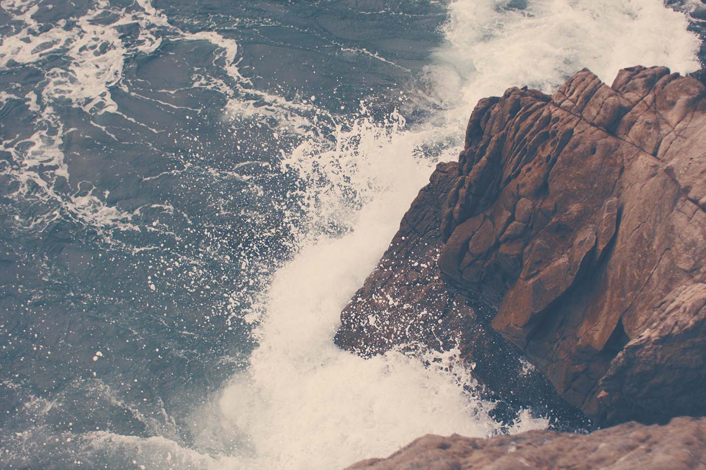
All images are inherently responsive. For example, the following image is quite large, but that's okay; it still fits.
Responsive Videos
To make videos responsive, wrap them in an element with class fs-embed and a class for the aspect ratio — academy, widescreen or ultrawide. They will then be 100% width and respond to the size of their container.
This will work for the following embedded elements within — <iframe>, <object>, <embed>, or <video>. And to use a different type of element, you can add class embed-item to it.
The previous example was a widescreen example at 16:9, while the next example below utilizes the ultrawide class to display the video at 21:9.
Element
Aspect Ratio
.fs-embed.academy
4:3
.fs-embed.widescreen
16:9
.fs-embed.ultrawide
21:9
Media Captions
When captioning an image, wrap it an element with class .fs-caption. And then below your image, add your text wrapped in an element class caption-text.
Donec rutrum, est vel posuere congue, arcu mauris euismod libero.
Donec rutrum, est vel posuere congue, arcu mauris euismod libero.
You could also caption a video with this same approach. In the following example there is a responsive embed added within our .fs-caption element.
Donec rutrum, est vel posuere congue, arcu mauris euismod libero.
Donec rutrum, est vel posuere congue, arcu mauris euismod libero.
Image Alignment
For centering and floating images, you can use the standard alignment utility classes — align-center, and align-left, align-right. And keep in mind that floated elements will get cleared once you reach the xs breakpoint.
Donec rutrum, est vel posuere congue, arcu mauris euismod libero, eget mattis est orci vitae nisi. Cras eget urna nunc, nec aliquet dui.
Nullam in dolor sed leo cursus posuere sit amet non tortor. Sed facilisis risus sed massa pellentesque sagittis. Quisque felis leo, commodo eu sagittis ut, suscipit nec lectus.
Sed congue quam non ante pharetra id aliquam nunc elementum. Donec et purus id dui pellentesque porta. Nam imperdiet fringilla nunc non malesuada. Donec rutrum, est vel posuere congue, arcu mauris euismod libero, eget mattis est orci vitae nisi. Cras eget urna nunc, nec aliquet dui. Cras sed lacus tellus, in porttitor tortor. Vivamus auctor mattis nunc, quis mattis justo vulputate at. Nam rhoncus mollis convallis. Nullam in dolor sed leo cursus posuere.
Responsive Sizing
By taking advantage of column classes from the grid system, you can achieve some useful results with combing image alignment and sizing.
Consider the following example. — We've got an image that's fairly large that we want to float to the left. So first we've added class align-left. Next, so it will display at 1/2 the width of the content area on desktop screens we add class col-lg-6. Then for tablets and larger mobile screens we add class col-sm-4 so that it will scale down to 1/3 width of the content area. And then when we get to small mobile devices, the image becomes un-floated and pops back to 100% width.
Donec rutrum, est vel posuere congue, arcu mauris euismod libero, eget mattis est orci vitae nisi. Cras eget urna nunc, nec aliquet dui.
Nullam in dolor sed leo cursus posuere sit amet non tortor. Sed facilisis risus sed massa pellentesque sagittis. Quisque felis leo, commodo eu sagittis ut, suscipit nec lectus.
Sed congue quam non ante pharetra id aliquam nunc elementum. Donec et purus id dui pellentesque porta. Nam imperdiet fringilla nunc non malesuada. Donec rutrum, est vel posuere congue, arcu mauris euismod libero, eget mattis est orci vitae nisi. Cras eget urna nunc, nec aliquet dui. Cras sed lacus tellus, in porttitor tortor. Vivamus auctor mattis nunc, quis mattis justo vulputate at. Nam rhoncus mollis convallis. Nullam in dolor sed leo cursus posuere.
Remember!Remember that our grid system uses Flexbox CSS and so the column classes alone will not float the images, but only size them.
Alignment and Captions
You can also float captioned images by adding your alignment class directly to the .fs-caption element, and not the image itself. Also keep in mind that for best results, you'll want to set your desired width on the .fs-caption element, as well; so let's just take the same approach we did in the last example.
Donec rutrum, est vel posuere congue, arcu mauris euismod libero.
Donec rutrum, est vel posuere congue, arcu mauris euismod libero, eget mattis est orci vitae nisi. Cras eget urna nunc, nec aliquet dui.
Nullam in dolor sed leo cursus posuere sit amet non tortor. Sed facilisis risus sed massa pellentesque sagittis. Quisque felis leo, commodo eu sagittis ut, suscipit nec lectus.
Sed congue quam non ante pharetra id aliquam nunc elementum. Donec et purus id dui pellentesque porta. Nam imperdiet fringilla nunc non malesuada. Donec rutrum, est vel posuere congue, arcu mauris euismod libero, eget mattis est orci vitae nisi. Cras eget urna nunc, nec aliquet dui. Cras sed lacus tellus, in porttitor tortor. Vivamus auctor mattis nunc, quis mattis justo vulputate at. Nam rhoncus mollis convallis. Nullam in dolor sed leo cursus posuere.
Donec rutrum, est vel posuere congue, arcu mauris euismod libero.
Thumbnail Links
Thumbnail links can be useful to add a hover animation and icon to images. When an image is linked, add class fs-thumb-link to the wrapping <a> along with a Font Awesome icon.
In the following example, we've got an image wrapped in a link, and we've added class fs-thumb-link to give it the animation and added a Font Awesome icon. Hover your mouse on the image to see the effect.
These thumbnail links pair really nicely with modal functionality. In the following example we've linked to the image file and added class fs-image-modal-link to the .fs-thumb-link element. We're also now using the fa-expand icon.
Galleries
For displaying a gallery of thumbnail images, create an element with class fs-gallery, and this will give you a flexible grid of images. You can set the number of columns by adding class gallery-columns-{number} — 1-9 columns are supported here.
...
Within your .fs-gallery element, each item will be given the class gallery-item. And within that, wrap thumbnail images in a .gallery-icon element and captions with a .gallery-caption element.
...
...
So let's put that together. — The following is the most basic example, where we've created a gallery of thumbnail images, with no image links or captions just yet.
By scaling your browser, you can see that the gallery grid is flexible. And when the viewport gets to the xs breakpoint, the grid becomes two-columns; this is the behavior for all grids that are more than one column.
...
Next, we'll add captions to our .gallery-item elements. We do this by adding a .gallery-caption element within each.
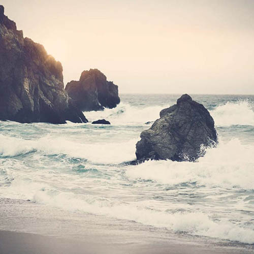
A Quiet Beach
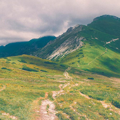
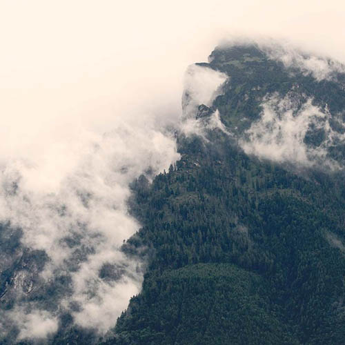
Lone Mountain Top
Long Path to Zen
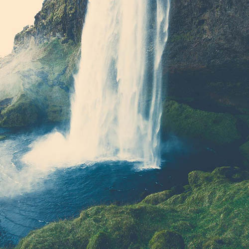
Waterfall Closeup
Our Swimming Hole
From Up Above
            A Quiet Beach


    ...
The flexible grid structure of a .fs-gallery element is really just a starting point for utilizing it with other features. In the following example, we've added the following functionality:
An additional class fs-modal-gallery has been given to the .fs-gallery element to setup a modal gallery.
Each thumbnail image is linked to an enlarged version of itself.